


![RD-08-09OPENER[finished].png](https://images.squarespace-cdn.com/content/v1/548b6d11e4b0c85246a256cb/1477617298328-AM5WZW8TUGV7747R5U9K/RD-08-09OPENER%5Bfinished%5D.png)

![RD-14-15James[finished].png](https://images.squarespace-cdn.com/content/v1/548b6d11e4b0c85246a256cb/1477617988388-N5Y9WCHYVXWQK4EAZ2OM/RD-14-15James%5Bfinished%5D.png)
![RD-28-29CharlieElevator[finished].png](https://images.squarespace-cdn.com/content/v1/548b6d11e4b0c85246a256cb/1477617996318-45V0F4OU4UIFSUH45P35/RD-28-29CharlieElevator%5Bfinished%5D.png)
![RD-38-39GeorgeMedicine[finished].png](https://images.squarespace-cdn.com/content/v1/548b6d11e4b0c85246a256cb/1477618003152-KUPJJ18YL8RB74E5XYUC/RD-38-39GeorgeMedicine%5Bfinished%5D.png)
![RD-60-61OPENER[finished].png](https://images.squarespace-cdn.com/content/v1/548b6d11e4b0c85246a256cb/1477618011646-T4PISY2UDESGZWQJZWMM/RD-60-61OPENER%5Bfinished%5D.png)


![HQ-JKT-EGYPT[REPRO].jpg](https://images.squarespace-cdn.com/content/v1/548b6d11e4b0c85246a256cb/1420689673660-C84CIS1GSNNQXUDXMWOH/HQ-JKT-EGYPT%5BREPRO%5D.jpg)
![HQ-JKT-GREECE[REPRO].jpg](https://images.squarespace-cdn.com/content/v1/548b6d11e4b0c85246a256cb/1420689668408-OISO22AII26Z78VE269E/HQ-JKT-GREECE%5BREPRO%5D.jpg)
![HQ-JKT-MEDIEVAL[REPRO].jpg](https://images.squarespace-cdn.com/content/v1/548b6d11e4b0c85246a256cb/1420689685225-G3TVDEBEK43SZ0TQDQ54/HQ-JKT-MEDIEVAL%5BREPRO%5D.jpg)
![HQ-JKT-ROME[REPRO].jpg](https://images.squarespace-cdn.com/content/v1/548b6d11e4b0c85246a256cb/1420689692318-FFUC4ZRIH1DCZQG14CHM/HQ-JKT-ROME%5BREPRO%5D.jpg)


![QMLB3-Dino[pg01-31]-9.jpg](https://images.squarespace-cdn.com/content/v1/548b6d11e4b0c85246a256cb/1418430873867-CH48Q9HFRSK3UK8QYAZ6/QMLB3-Dino%5Bpg01-31%5D-9.jpg)
![QMLB3-Dino[pg32-64]-6.jpg](https://images.squarespace-cdn.com/content/v1/548b6d11e4b0c85246a256cb/1418430863462-TWXT00CB60172YCLZFS5/QMLB3-Dino%5Bpg32-64%5D-6.jpg)
![QMLB3-Dino[pg32-64]-8.jpg](https://images.squarespace-cdn.com/content/v1/548b6d11e4b0c85246a256cb/1418430923290-G0OE12T6TWPMO1YNMH7I/QMLB3-Dino%5Bpg32-64%5D-8.jpg)


![DinoDig-JKT-Combats[HR].jpg](https://images.squarespace-cdn.com/content/v1/548b6d11e4b0c85246a256cb/1421125508702-4L3V9LHUEWT8NAPNPTOV/DinoDig-JKT-Combats%5BHR%5D.jpg)
![DinoDig-JKT-Families[HR].jpg](https://images.squarespace-cdn.com/content/v1/548b6d11e4b0c85246a256cb/1421125532352-1FSWKT23NDBY82OHT47D/DinoDig-JKT-Families%5BHR%5D.jpg)
![DinoDig-JKT-Food[HR].jpg](https://images.squarespace-cdn.com/content/v1/548b6d11e4b0c85246a256cb/1421125528639-N4EGSNAJVEINIOKCT4IV/DinoDig-JKT-Food%5BHR%5D.jpg)


17
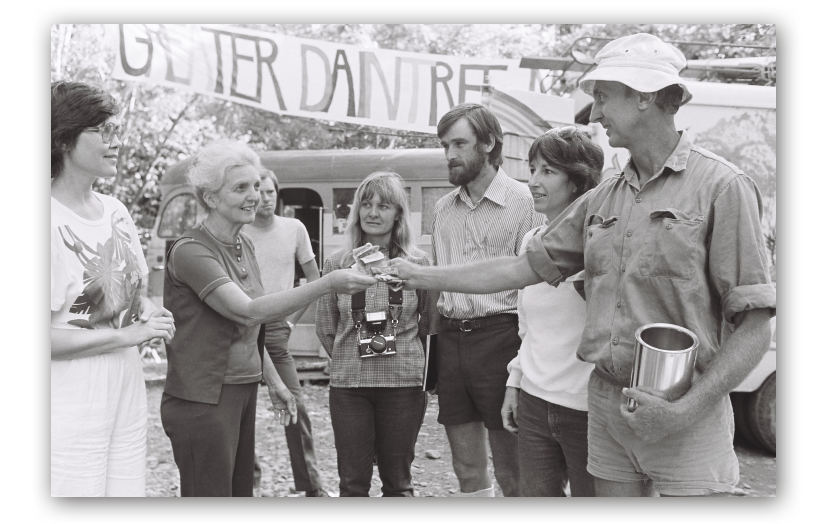
Daintree Blockade

7
Image Manipulation Roald Dahl

7
Super Skills Movie

7
Super Skills Guitar

8
Will You Be My Sweetheart

14
Smithsonian Awesome Adventures

5
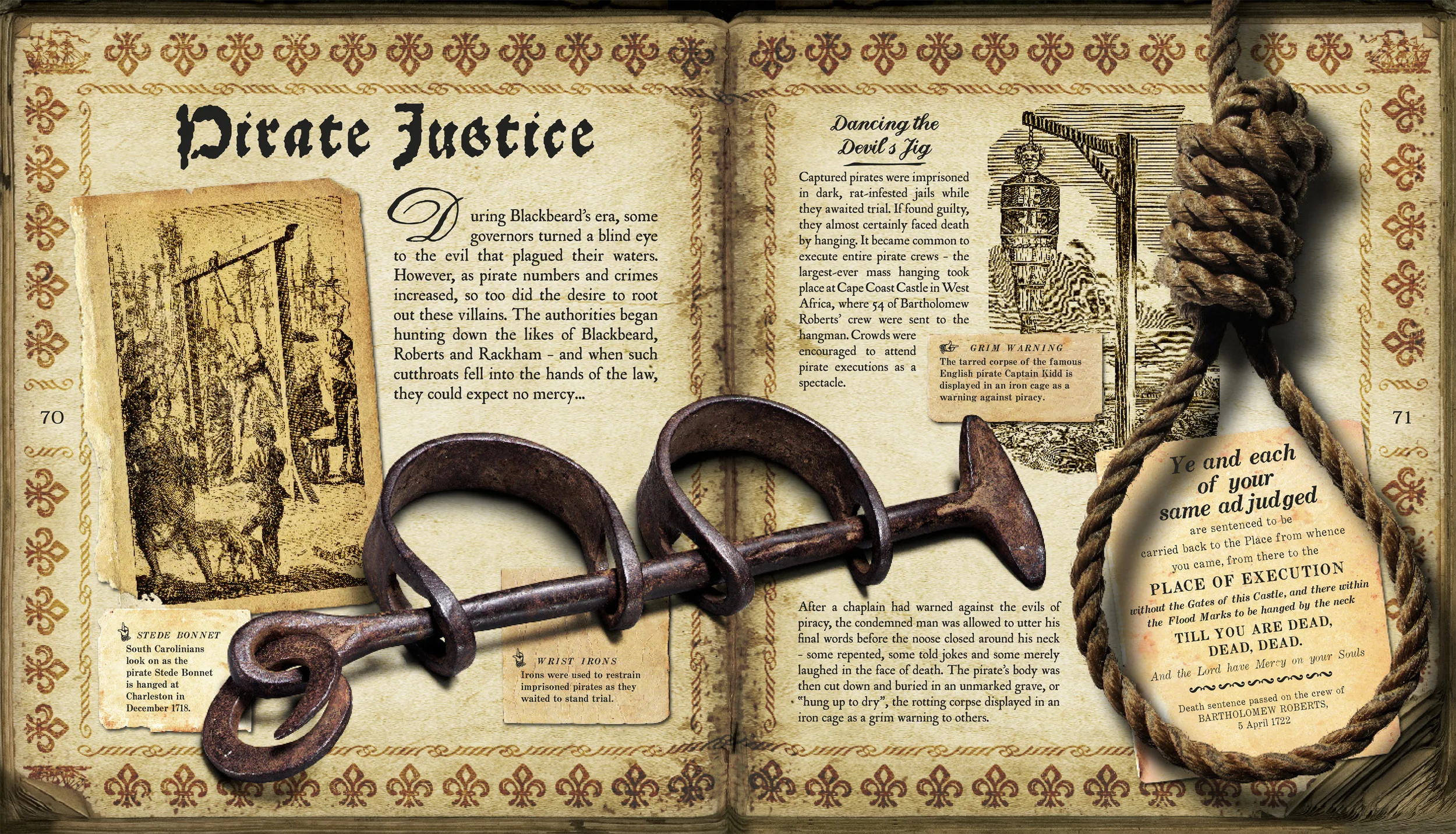
Blackbeard's Pirateworld

5
History Quest series covers

4
Trade Book covers

4
Rough Guides cover concepts

1
Myanmar 1st Hand

6
Sweet Treats cover and internals

5
The Men Who Mapped the World

4
My Little Book of Dinosaurs

15
ScienceQuest internals
6
Space Guides

8
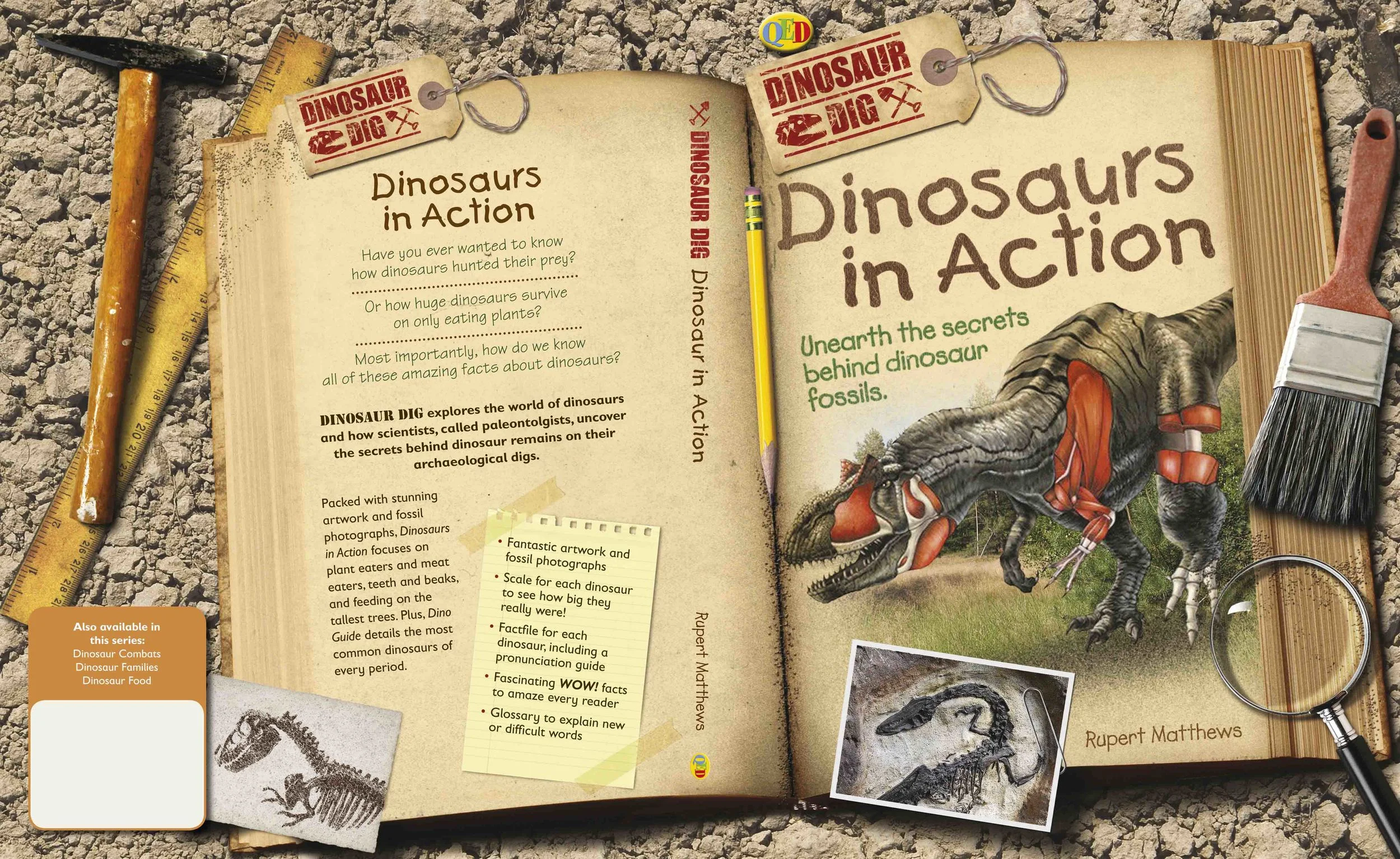
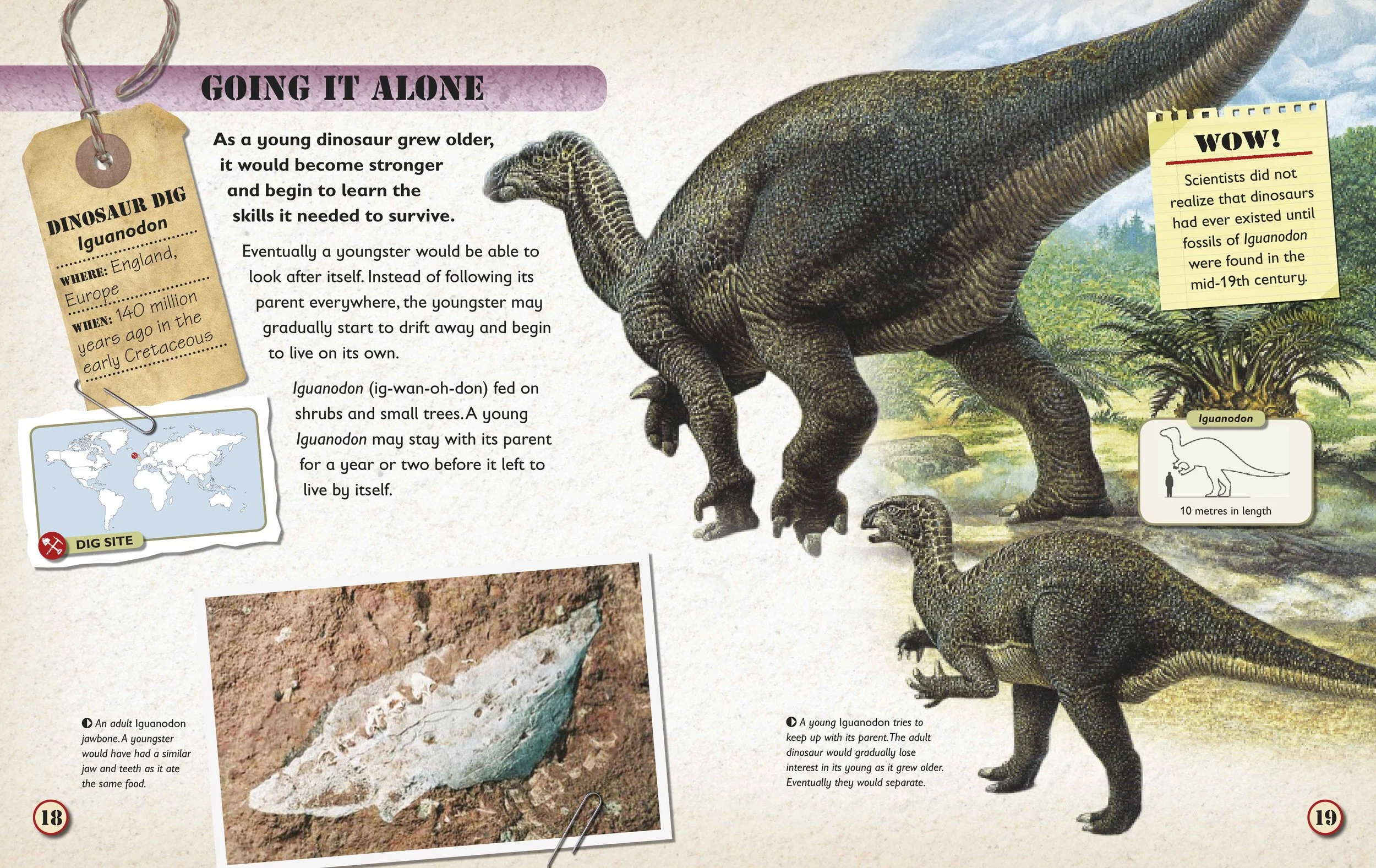
Dino Dig series covers and internals

9
d4daisy craft series

9
d4daisy workshop series

10
Day at the Zoo